Question #6402073Single Choice
Math
Question
The graph below shows the total number of music album sales, in millions, each year from 1997 through 2009.
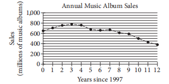
Based on the graph, which of the following best describes the general trend in music album sales from 1997 through 2009?
Based on the graph, which of the following best describes the general trend in music album sales from 1997 through 2009?
Options
A
Sales generally increased each year since 1997.
B
Sales generally decreased each year since 1997.
C
Sales increased until 2000 and the generally decreased.
D
Sales generally remained steady from 1997 through 2009.
Answer & Analysis
Click "Show Answer" to reveal the answer and analysis
Want More Practice Questions?
Access thousands of practice questions with detailed explanations on Scholardog.
Practice Now - It's Free!